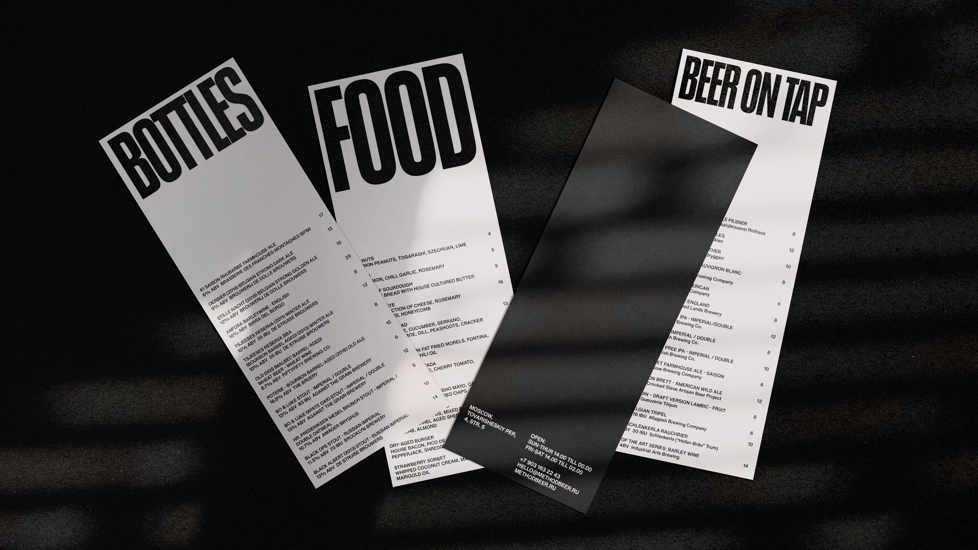
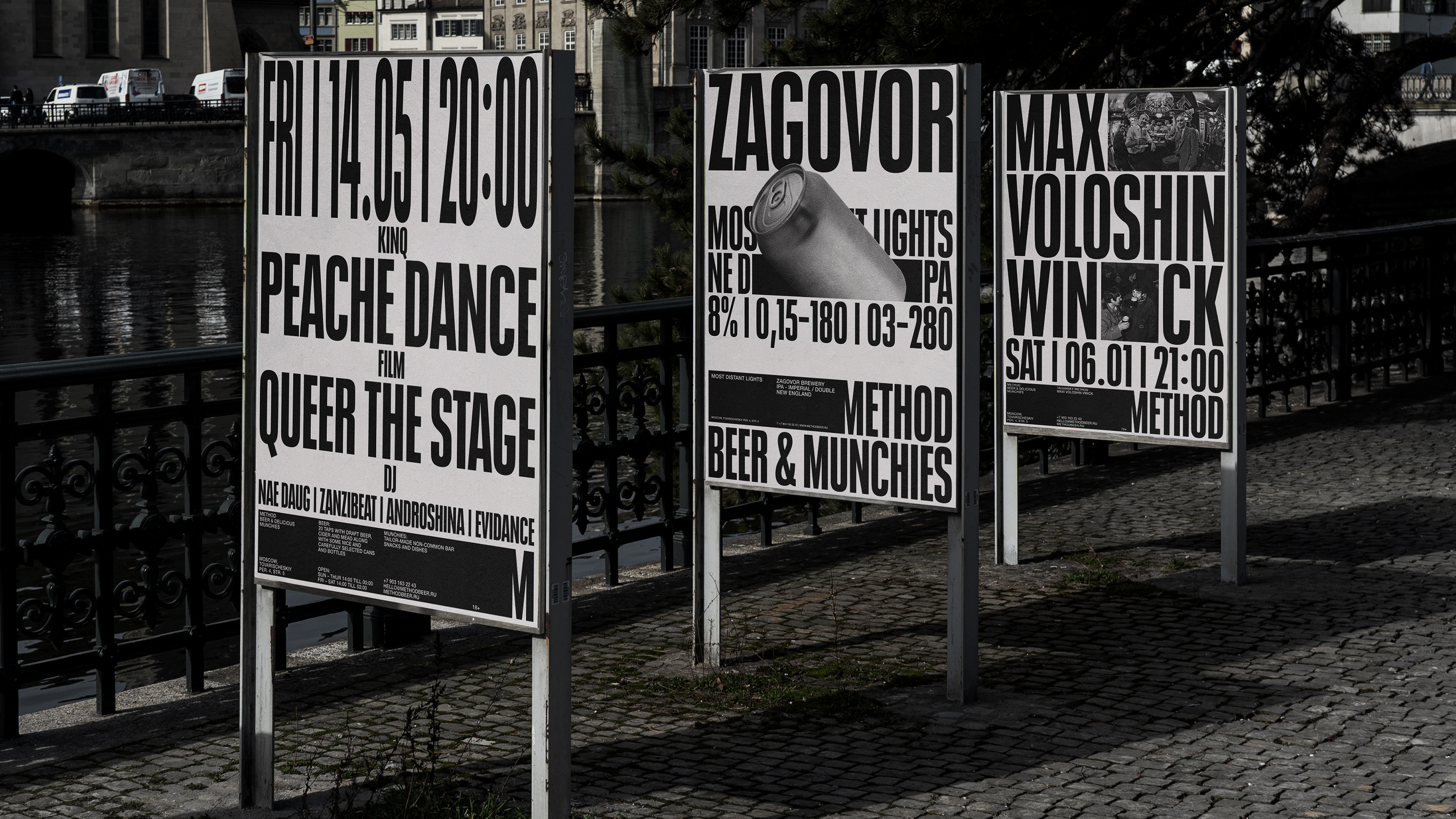
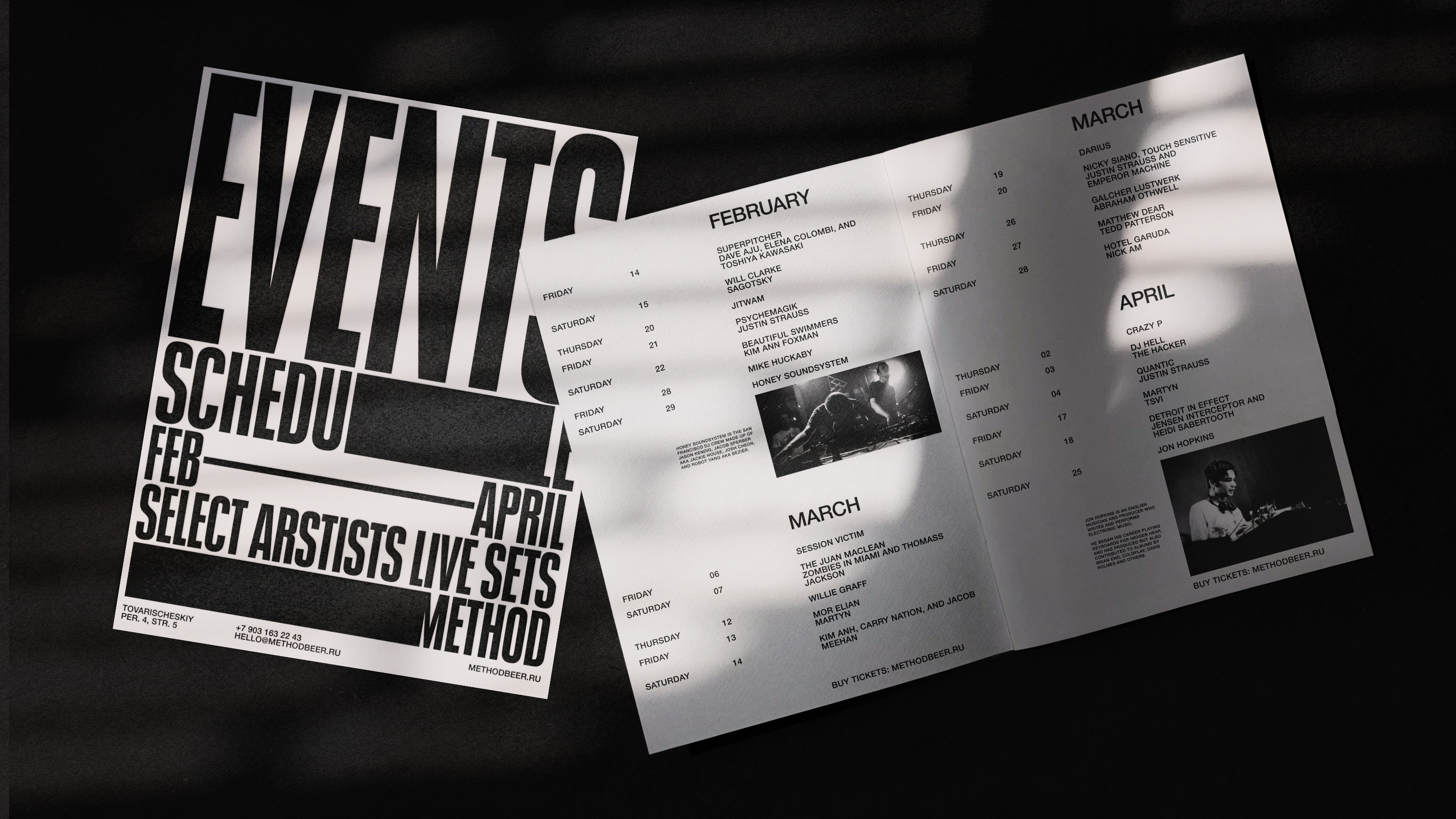
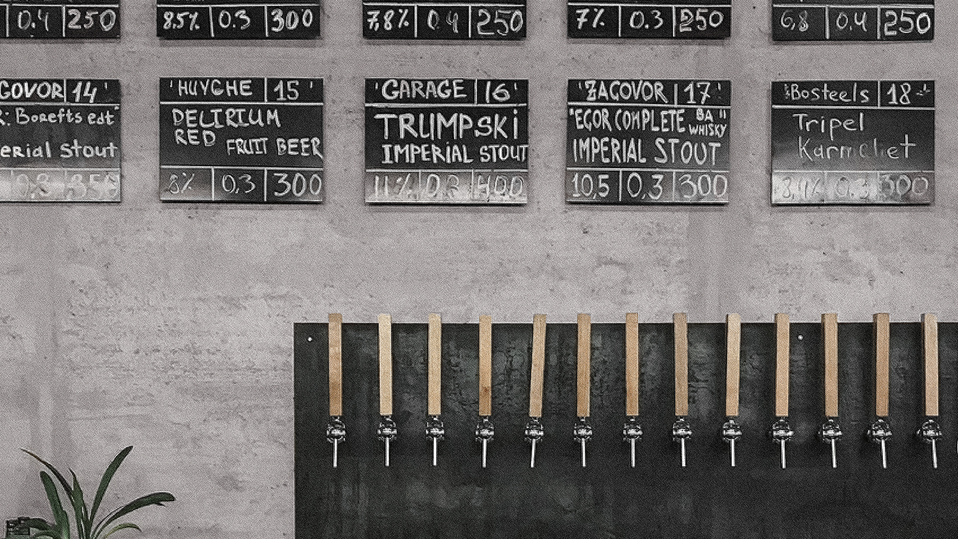
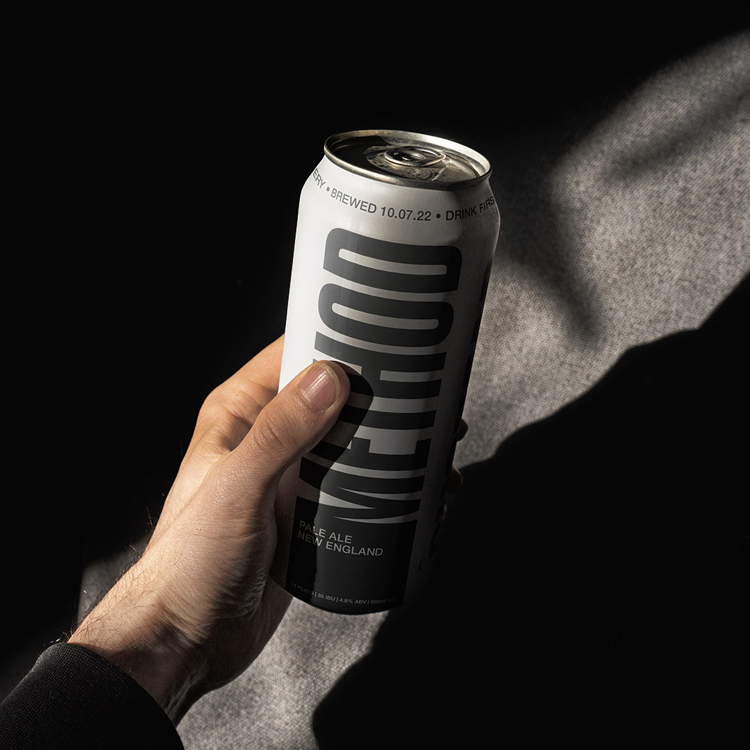
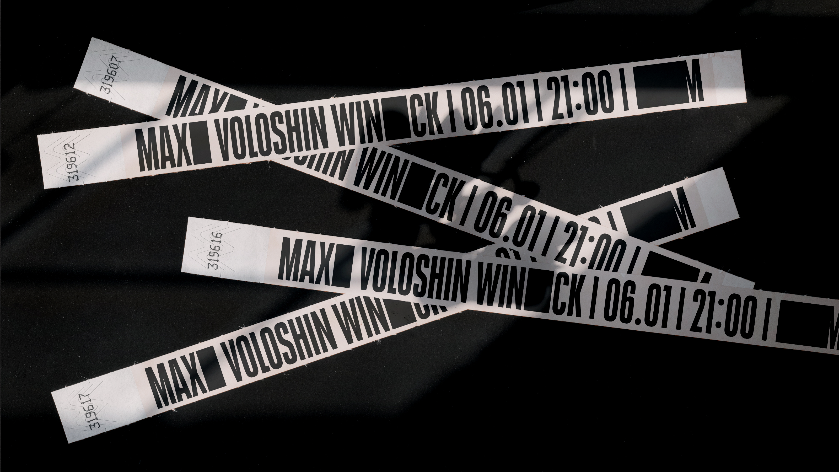
Method is a restaurant, bar and event space in the heart of Moscow, Russia. Built on the site of an old ceramic factory, it carries the spirit of Russian constructivist traditions. Working with interior designers, we came up with a warm yet sharp identity, that marries the flexibility of ceramics, and rigidity ofRussian modernist design aesthetics: think black square. The black plaques on the restaurant walls stretch, modify and attach to letters in the identity. Typography is flexible and clay-like - it flows and bends just like pottery.
The visual language built on sharp typography and soft muted colors is carried across materials and assets — merchandise, coasters and glasses, interior spaces, event brochures, website, posters and menus.





Partners and collaborators: Stepan Petrov, Zihao Wang.
Publications and highlights: Another graphic, Fonts in use, Morrre design, Mindsparkle magazine, Mockup Maison, Swiss graphic, Designer’s bookshop
Next project ︎